
The Most Overlooked Productivity Tool on Your Mac Isn't an App
It's Hiding in Accessibility - and It Takes 30 Seconds to Activate.


I’m turning 43 in April.
My age doesn’t really stress me out. But the other day I caught myself sliding a little closer to my MacBook while reading an email.
That was a moment. Reading glasses are apparently coming sooner than expected.
My wife laughed at me, but at least my Mac is on my side. Accessibility is packed with small features that not only give my eyes a break, but quietly make my whole workday more focused.
How you can use these exact features to make your life a little easier — and become more productive without even trying — that’s what today is about.
The Wrong Assumption
I don’t know about you, but I always dismissed Accessibility on my Apple devices. Ignored it completely.
No idea who would ever need that — certainly not me. The name alone sounds terribly boring, and the concept felt like something meant for other people. But thankfully, my eyes forced me to take a closer look. And along the way, I discovered not just tools that help my eyes, but a whole range of genuinely useful features.
These tools can make a real difference for people with specific accessibility needs, but they’re also incredibly helpful for everyday use. They can meaningfully improve comfort and support focused work. No installations, no extra costs — Accessibility is simply there, waiting for you to switch it on.
Before we get into which features I can no longer live without, let me show you how to access them quickly, without fighting your way through System Settings every time.
The Shortcut You Didn’t Know About
You can add Accessibility shortcuts directly to your menu bar or Control Center — or both, if you like.
All it takes is a quick trip to System Settings, where you click on Menu Bar in the sidebar. There you’ll find the option to add items. From the list, select Accessibility and decide whether you want it in the menu bar or the Control Center.

I prefer the menu bar option. I use Control Center far more on iPhone and iPad.
Either way, both give you fast access to a list of features you can toggle on or off directly, complete with keyboard shortcuts and a link to each feature’s full settings.
It’s a small change, but it makes these powerful tools much easier to reach.
Small Features, Big Impact
I’m not going to walk through every single Accessibility feature — there are simply too many.
But I want to show you the tools I use regularly and how they help me day to day. For a sense of the full scope, here’s what my Accessibility shortcuts menu looks like when I open it:

You can already see which features I have always enabled: Zoom and Reduce Transparency.
Zoom
This brings us right back to those 43 years I mentioned at the start.
I’ll probably need reading glasses eventually, but for now I’m holding out. And on my Mac, the Zoom feature is doing a fine job meanwhile.
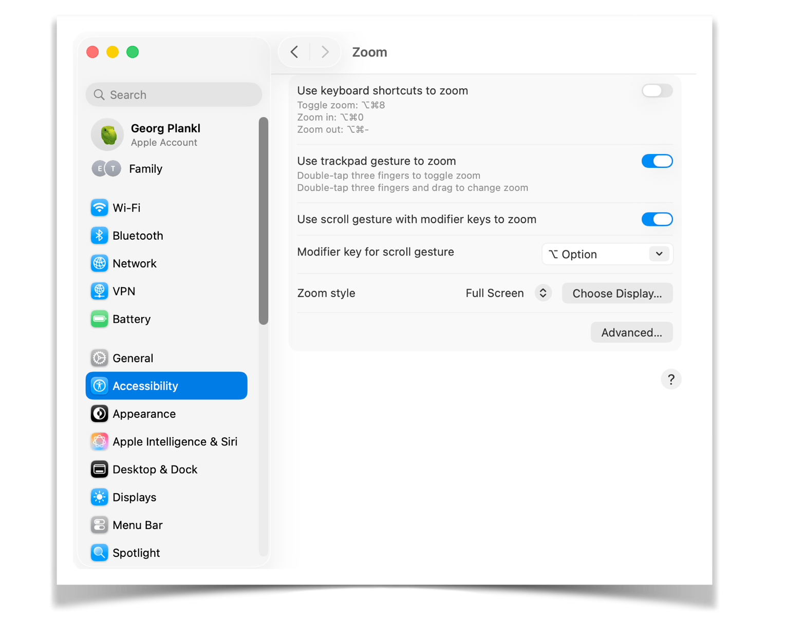
In the settings, you can choose whether to control Zoom with keyboard shortcuts or the trackpad. I prefer the trackpad — combined with the Option key as a kind of activation button. Whenever I struggle to read text or navigate a menu, I hold that key and zoom in with two fingers on the trackpad.
And this Zoom works everywhere, not just in PDFs, images, or Safari. In the Mac menu, inside apps, or right on the desktop.
What I like most is that the Mac does all the work. I don’t have to change anything in a file or dig through settings. A magnifying glass simply appears over my content, and when I no longer need it, it’s gone in a second.
There’s also “Hover Text” in Accessibility, which enlarges only text — in any menu or app. I don’t use it myself, but if targeted text enlargement is what you’re looking for, it might be the right tool for you.
Reduce Transparency
As I said before, this is one setting I have always enabled, and I notice immediately when it’s accidentally turned off.
By default, the Mac displays many surfaces with a subtle transparency: the Finder sidebar, the Dock, the menu bar. It looks polished, no question. But it also means the background is always slightly visible, and the brain ends up processing content in the background that isn’t actually relevant.
“Reduce Transparency” replaces those translucent surfaces with solid, clear colors. The way things used to look. The screen might seem slightly less elegant at first glance, but I immediately notice less visual noise and better clarity — which, almost as a side effect, helps my concentration.
This is the kind of setting you only appreciate after you’ve used it for a while.
Increase Contrast
Things get even sharper when I add “Increase Contrast” to the mix.
The feature does exactly what it says. Borders, dividing lines, and interface elements are displayed with noticeably more definition and clearer outlines — a bit like the way my kids draw pictures and outline every object in black. That might not sound like much, but the screen becomes more structured in a way that feels unusual at first, and then genuinely pleasant.
Not everyone will love the visual change, and that’s fine. But it’s worth trying. It might be exactly the setting that makes working on your Mac feel more comfortable.

Color Filters
This is my personal favorite on this entire list. And also the feature I dismissed the longest.
Your Mac lets you apply different filters to the display — originally designed to help people with color blindness. I use only one: Grayscale. Which essentially means bringing black-and-white television back to my laptop. That sounds like a terrible idea, I know.
Why own a modern screen just to run it in black and white?

I thought the same thing, until I tried it.
The screen suddenly feels so much calmer. No colorful app icons competing for attention. No red notification badges from emails or WhatsApp messages that you’re trying to ignore but somehow can’t. Our brains respond to color cues whether we want them to or not. Grayscale simply removes that stimulus from the equation.
What’s left is a screen that almost feels analog — for me, it’s perfect for focused writing sessions.
I don’t keep it on all the time, but it’s become another way for me to work with deeper concentration, similar to noise-cancelling headphones or Do Not Disturb on my iPhone.
Accessibility Reader
I only discovered the Accessibility Reader recently, it’s part of macOS Tahoe, so it’s still pretty new.
I would probably have missed it again if I hadn’t been taking a deeper look at Accessibility settings anyway. What it does sounds simple: it displays text from any app in a distraction-free, full-screen view. No menus, no clutter — just the text, in a layout you can customize yourself: font, line spacing, color, and background.
Think of it as Safari’s Reader Mode, except it works everywhere, not just on websites.
I now use it mainly for proofreading my writing and for reading longer emails without distraction. The difference is surprisingly noticeable — when the text is the only thing on the screen, you simply read more carefully.
Background Sounds
The last feature I want to introduce fits neatly on the “Focus” shelf, and I use it every single day.
Whenever I’m working and don’t want music — because lyrics distract me, or I just want a steady, uninterrupted flow — I switch on Background Sounds. Your Mac comes with a whole range of built-in options, from steam to a moving train:

My absolute favorites are ocean waves and simple rain.
For me, they create a kind of acoustic shell without ever drawing attention to themselves. They block out distractions — my kids chattering, the phone ringing, our dog barking — without cutting me off from the world entirely. That’s also why I use Background Sounds at school, in my office.
They put me in a state of deep concentration while still allowing me to be reached when something really matters.
Final Thoughts — The Reading Glasses Can Wait
I’m still 42. And the reading glasses are staying in the drawer a little longer.
But I’ve learned that there’s nothing weak about getting a little help, especially not from tools that are free and built right into your Mac.
For a long time, I thought Accessibility was meant for someone else. For people who truly needed it.
I see it differently now. Zoom, Grayscale, Reduce Transparency, Background Sounds — none of these are workarounds. They’re smart settings for anyone who wants to work with more focus, more comfort, and less friction.
Hiding in Accessibility, and activated in 30 seconds.
Thanks for reading,
Georg
Thanks so much! When you share my content, I take that as a pretty good sign I’m doing something right 😉
Great content. I will share it in my newsletter.